An enterprise application for managing pharmacy sales reps teams. I recently worked on a healthcare digital consultancy’s flagship enterprise product—an advanced web platform that enables pharmaceutical clients such as Eli Lilly and Pfizer to manage and optimize their field sales teams. The system supports large-scale operations, helping clients distribute their representatives efficiently across territories and monitor performance across multiple markets. The product has shown steady growth in adoption, reflecting both its strategic value and usability improvements.
My work centered on designing and refining interactions for several core features, including the map-based filtering of representatives and territories. In each initiative, I began by reviewing initial requirements and holding detailed discussions with product managers and developers to uncover the rationale behind them. These conversations often revealed opportunities to streamline, add, or adjust requirements before moving into design. I then produced Figma wireframes and interactive prototypes to communicate proposed flows and behaviors, ensuring all stakeholders could visualize the solution before development.
Making a Better Map Filter Widget
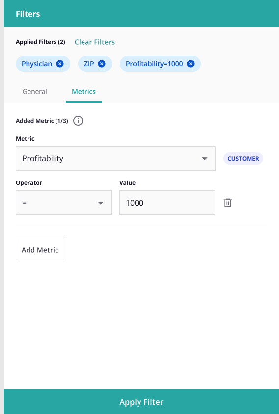
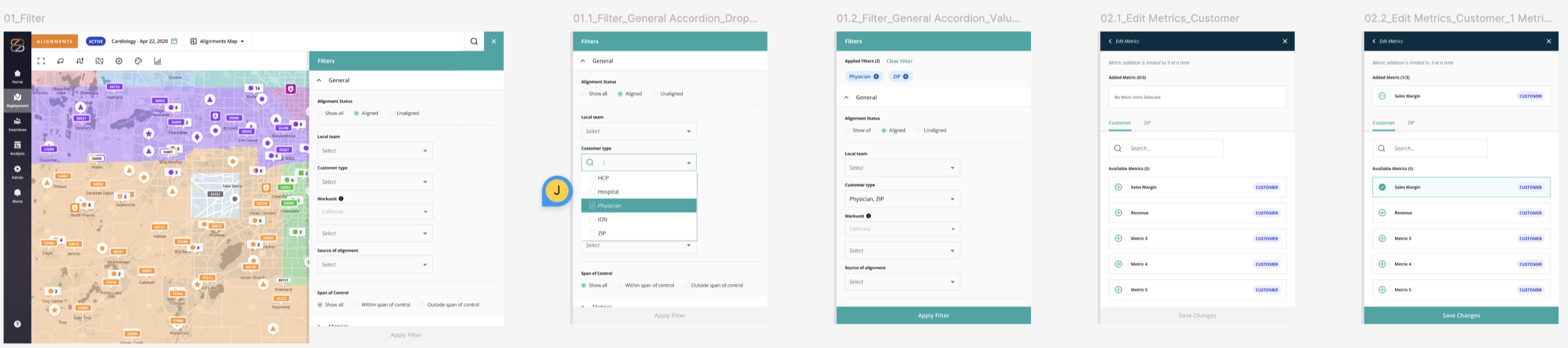
One feature, the map-item filtering interface, required particular attention to usability. Once item of note is the widget to add one or more pharmalogical products to the filter. The existing interface (see the 1st and 2nd screenshots from the right) was a dual list builder that, while consistent with the rest of the application, required a lot of clicks and was visually noisy. I decided on a design based on the Gmail way of adding attachments to an email. This pattern has been time-tested over the years. Using our UX design system (in Figma), I mocked up a visual pattern that coexisted well with the rest of our application.After an initial pass with product and development, I authored a semi-structured usability test script that guided participants through six primary tasks while allowing flexibility to explore unexpected insights. I made an interactive prototype in Figma that supported the completion of these six tasks, eliminating the need to develop the feature before usability testing. Usability test sessions were conducted with both internal and external users to compare perspectives.
The results validated that the redesign significantly improved task efficiency and reduced user errors. Moreover, we uncovered several refinements—such as consolidating related functions that were previously separated on the page—to further streamline workflows. These findings directly informed a subsequent iteration that made the feature more intuitive and cohesive, contributing to measurable gains in user satisfaction and overall product efficiency.