Discovery
My first project while working for a logistics and software company was to update a fleet management web application. Fleet sizes ranged from several to several thousands of vehicles. It served the following purposes:
- Clear and concise action plans for more than 18,000 faults (issues) with vehicles
- Prioritize needed repairs while avoiding unnecessary service visits.
- Diagnose your fleet while on the road
- Plot vehicle locations and nearby repair shops
Besides giving the application an interactive and visual design makeover, product owner and business analyst also wanted to add telematics data such as speed, heading, etc. to the rich information that the user can get from the site. This was a great opportunity for me to suggest further enhancements based on solving customers’ issues with the existing product. I spoke with user liaisons in order to determine what data was the most important, and what we could deemphasize in the user interface. For example, the health status of a truck was important. Indeed, the fleet managers wanted to know which trucks were broken down, which needed immediate repairs, and which could wait for such repairs. I then had further discussions with the product team and developers. Also, fleet managers wanted an aggregate view of their fleet, in order to strategize more effectively. The table of vehicles in the then-current version of the product was too cluttered, effecting scanability and ability to compare rows.
Design
Based on the discovery phase of the project, I created a flow of screens for the users. It consisted of:
- Dashboard: A view for the overall fleet status. This included a breakdown of vehicles that are in various stages of health, along with a map showing health and location.
- Vehicle List: A table view which is a feed comparing the individual vehicles in terms of health, speed location, etc.
- Vehicle Details: A detailed view of a particular vehicle. This helps in scenarios where there is a problem vehicle that needs attention and analysis.
- Reports: Reports that can be generated on-demand involving driver behavior, idling miles, etc.
- Mapping: Allows fleet managers to tell their vehicle drivers where nearby repair shops, rest stops, etc. can be found in case the drivers needed a pressing repair or were approaching the maximum allowable time to drive for the day, among other things.

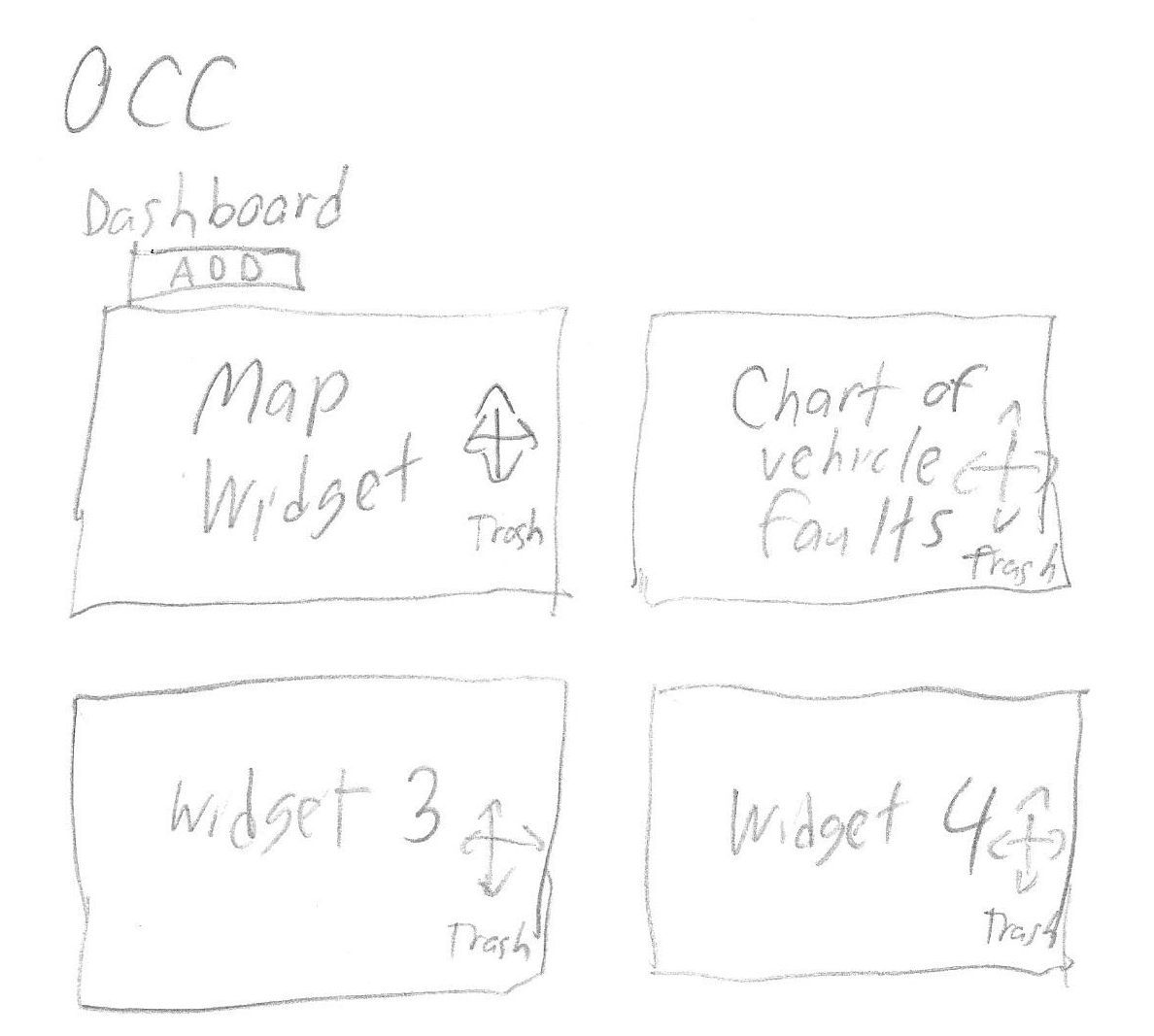
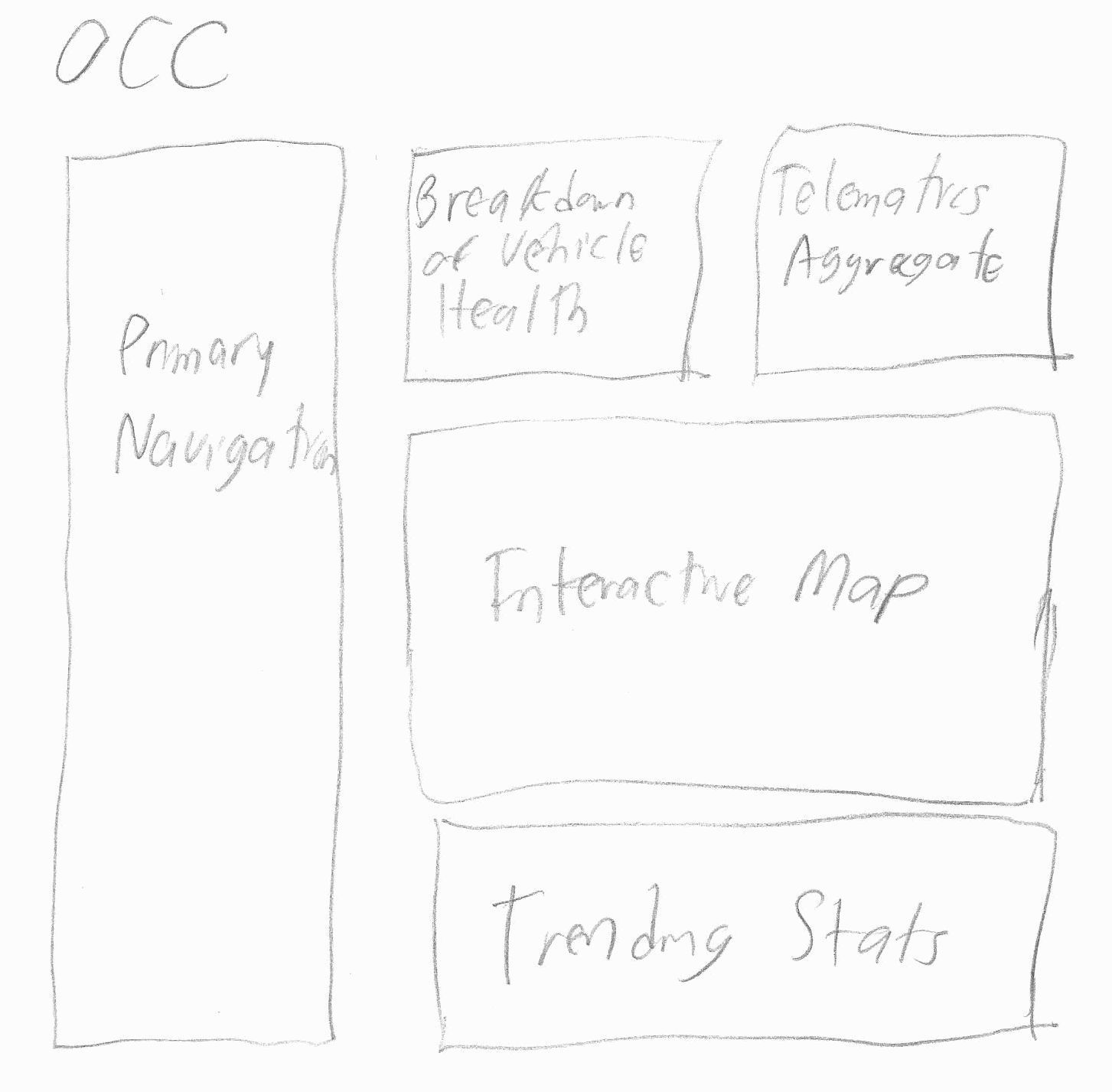
At first, I used paper and pencil sketches as a means of brainstorming. This low-fidelity approach was great because it was fast, did not prime the team into accepting a design that may be suboptimal, and avoided the team being glued to a particular approach to the users' needs. For example, our team posed the idea of giving the dashboard configurable "widgets", but the value of customization was uncertain, and it would have taken more development effort. Because the mockup was quick to make, we were able to quickly pivot to other, more fruitful design approaches. I knew from meetings that fleet managers wanted to know about fleet health, so I sketched out various ways of visualizing overall fleet health.
When I had narrowed down the overall design to several ideas, I moved to Axure for crafting interactive mockups. Design discussions involved user liaisons, business analysts, product managers, and developers. I persuaded the team to make the pie slices proportional. In other words, if half of the trucks were healthy, that slice would be half of the circle. User experience choices were weighed against business requirements and development constraints. I worked closely with a visual designer during this process for visual specifications. Later versions of interactive mockups were shown at trade shows to generate customer feedback and excitement.
Fleet Management Tool Interactive Mockup (Axure)Implementation
I attended meetings checking on the progress of the application’s implementation progress. I would give feedback on if the application was approximating the interactive mockup and visual design. Occasionally the interactive mockup would be tweaked if there was a development constraint that necessitated it. Other times, I successfully convinced the team to implement a feature according to interaction spec even though it was a little more development work. For instance, a location search for the fleet health map was implemented so that fleet managers could focus on a particular portion of the map. This paid dividends in terms of the user experience. In another instance I agreed with developers not to make the doughnut chart on the dashboard clickable, as the release date was approaching and developers had a lot of difficulty making it clickable.
Evaluation and Redesign
After the new version of the product was released, I used heat maps to gain user insight. For instance, I found with the maps that users mainly used a few of the available filters (the 80/20 rule at work).
These insights served as inspiration for a round of usability testing. I got four internal individuals to participate I first asked intro questions about the participant’s computer usage to measure tech-savviness. They were moderately tech-savvy but not much more than fleet managers. I identified six important and/or common tasks that users of the fleet management product performed. I had usability test participants perform these tasks. Some interesting findings came out of the research. For instance, users expected the doughnut chart to be clickable. Indeed in screen recordings the users kept trying to click on the doughnut chart. Also, users thought there were too many filters at first, and as a result forgot to reset filters between tasks. some users had difficulty finding out the problems that a particular vehicle had. Vehicle headings (e.g. "northwest") were also requested to be in the vehicle details page, to give the user a quick idea of where the vehicle is going.
As a result of the heatmaps, analytics, and usability testing, I designed an enhancement to the application where most filters were collapsed and could be expanded on click of “More Filters”. This got positive feedback from the fleet managers. I lobbied successfully to make which faults a vehicle had more prominent in the user interface. Finally, I changed the primary navigation from left to top in response to fleet managers wanting a bigger area for the dashboard and other maps.
Later changes focused on integrating this product with others that my company had. This was so the user experiences could be more similar between the tools. This allows users to apply what they learned in one tool to another, and learning is thus faster. Examples of this integration include designing a common header between the products. I also started to provide links between the products, so that the user can more seamlessly switch between products if their workflow encourages it.
